 The cover for Ten Things I’ve Learnt About Love was designed by the fabulous Jo Thomson at MacMillan. She’s very kindly answered some of my questions about the process, and shared some of the designs that didn’t make it onto the cover…
I’m fascinated by how you distil a whole novel into a single image. How
do you even begin?
It starts with a cover brief from the editor, which gives an idea of what
type of book it is, the tone and content. Sometimes you get a couple of
ideas straight away, but usually I read the manuscript. ‘Ten Things…’
was great because it had loads of stuff that worked well visually; such as
the found objects and Daniel’s synaethesia.
Are there any rules or basic principles you abide by when designing
book jackets?
I don’t think so, I think the best jackets are the ones that stand out and
break away from the genre and style conformities. Covers should represent
the books they contain.
My understanding is that you and other designers presented a range of
different options for the cover of TEN THINGS I’VE LEARNT ABOUT LOVE. How
many designs did you come up with? And would you be happy to share any of
the alternative designs?
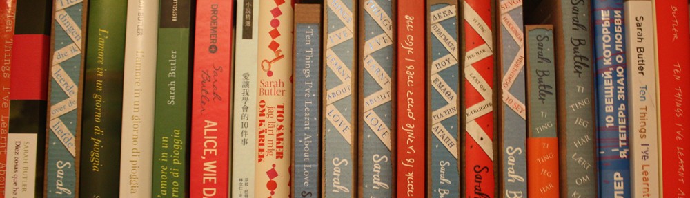
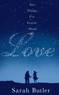
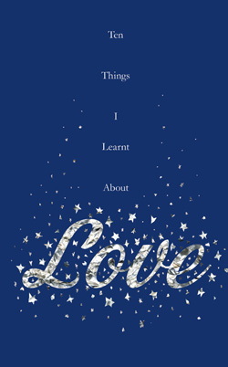
There were three of us initially working on it and there was a huge range
of stuff! I would say there were about 40 covers in all. Here are a few that didn’t make it…


How did the chosen design for TEN THINGS I’VE LEARNT ABOUT LOVE come
about and then evolve?
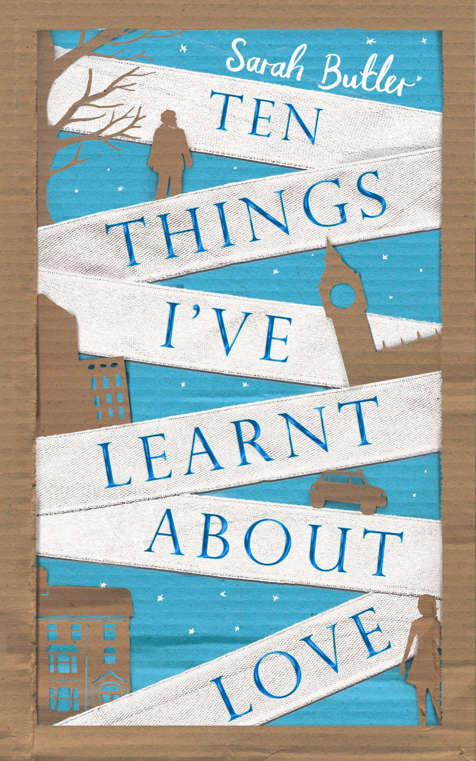
Honestly, I don’t know, it just sort of happened while I was playing
around with some different ideas. I really liked the idea of using
different textures for the cover, cardboard seemed a good choice as it has
a visual connection with homelessness. I tried a few colours as a plain
brown cover was probably not going to make an attractive cover. I added
the stars later as I thought it need that last extra something.
Is it difficult/different to design a cover for a book with such a long
title?
It’s harder when the words are very different lengths, ‘Ten things’ wasn’t
too difficult as the words are only 3-6 letters long a cover with only
two words of different lengths like as ‘My Hippopotamus’ would be trickier one.
I love how the cover design continues onto the inside folds of the dust
jacket and even the spine of the hard cover. Was that always part of your
vision for the book?
These bits tend to be the things I think of last so it kind of evolved
from the cover. I liked the idea of having bright endpapers so the blue
seemed a good choice, and *spoiler alert* I liked the bit at the end where
daniel and Alice look at the stars together- so it seemed fitting.
What do you like most about the cover of TEN THINGS I’VE LEARNT ABOUT
LOVE?
I like it as an entire package, its easily one of the most enjoyable
covers I’ve worked on!
Do you have a favourite book cover (designed by yourself or someone
else)?
I have loads, I just stand in Waterstones drooling!
A huge thanks to Jo for answering my questions. I might call my next novel ‘My Hippopotamus’ just to see what she comes up with…